

EZ Links @ Smartsheet
Modernizing our linking UX for hackweek!
✍🏽 About Smartsheet
Smartsheet is an industry-leading enterprise work management platform, boasting millions of passionate users!
The same project data can be dynamically viewed in various different ways (card/boards, timelines/gantt charts, and tables/grids). Content/asset management, workflows, mini-apps, dashboards, and more make for a robust CWM ecosystem capable of servicing large enterprise customers and small nimble customers alike.

⚠️ The Problem
- Links in the various views of the Smartsheet platform are a bit rough around the edges.
- Viewing a link in a kanban board, for example, requires you to click into the card, opening a side panel with full fields available. Once there, links (raw URL strings) are not clickable and you have to copy and paste them into new tabs to visit them.
- This creates inaccessible links buried deep in the UX, which is not ideal in a product where users need to add links everywhere.
✨ The Solution
- Assemble a hackweek team to build EZ Links 🔗, a rich-text solution that brings the linking UX in our products into the modern age!
👯♂️ The Hackweek Team
- 4 Senior Design Technologists (Including me 👋🏽)
- 1 product team engineer
Hack the Sheet 2024 👨🏻💻
In all productivity tools, sharing links to external resources (docs, Figma specs, websites, etc.) is a CRUCIAL, high-frequency interaction. One of the best features ever is when you can simply copy a link, highlight text, hit paste and whatever you've highlighted becomes an inline link to that thing. SO good.
For Smartsheet's 2024 hackweek, I wanted to lead a team to implement this linking UX in our platform. As users of Smartsheet for project management during sprints and the like, this was personal 😈
💪🏻 Step 1 - Getting Situated
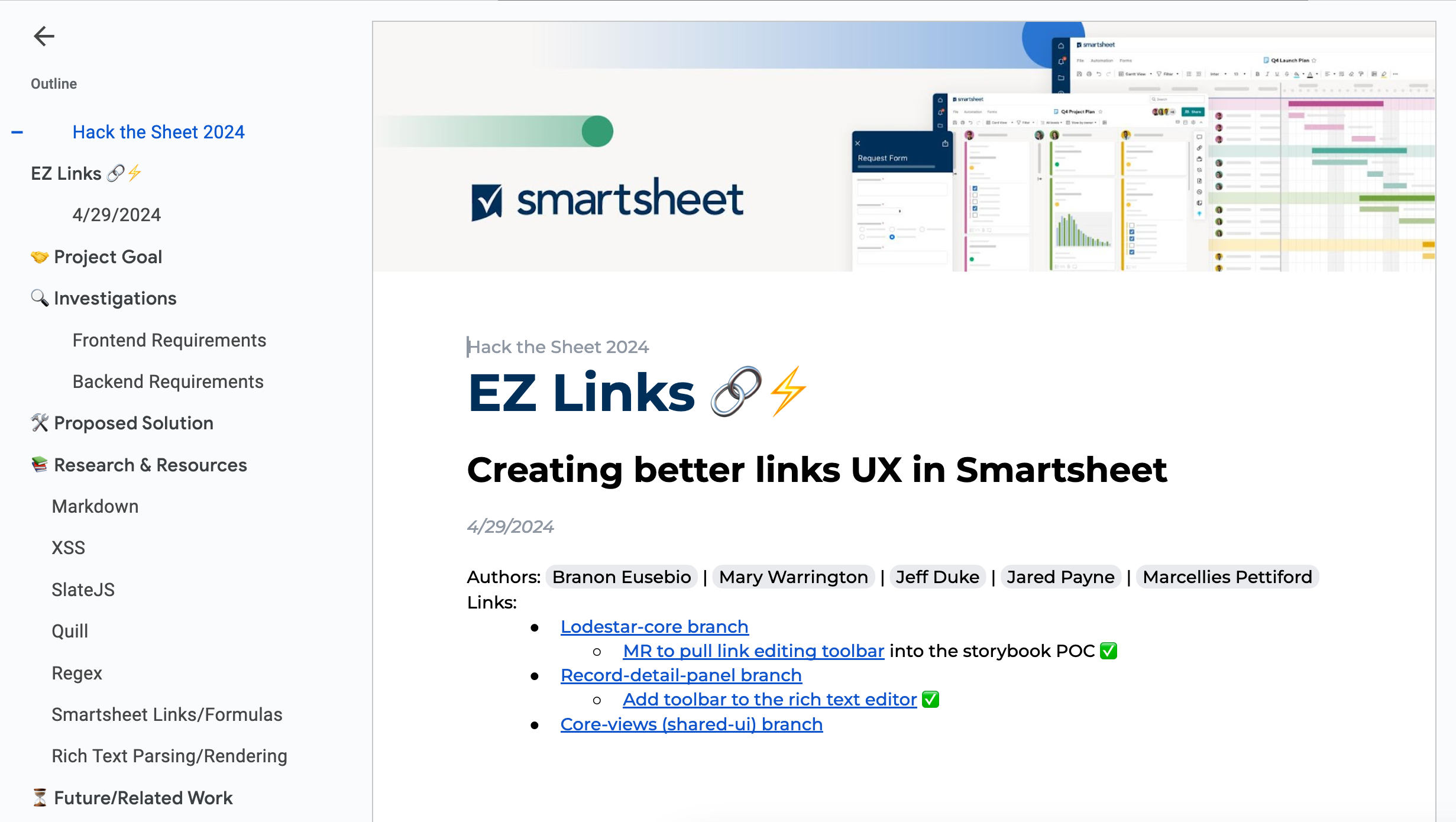
First things first - we needed to sync up to kick things off as a team. We started a nice doc to hash out our decisions, goals, todos, and explorations on technology choices, etc.
🔎 Step 2 - Explore Technologies
Our first challenge would be deciding on our technologies. We knew we needed a couple main things:
- A rich text editor
- A rich text renderer
Our Board view in the Smartsheet platform renders kanban-like columns full of cards, so teams can organize work. This would be the perfect spot to concept out the EZ links experience, since most people are adding links in tickets in this view.
We would generally need to implement a rich text renderer in the editor panel for a card's fields (mainly the description field), and then in the card itself where that data is displayed, we'd need to add a rich text renderer to compile any link nodes from the data payload into rendered HTML.
So we were off to the races to explore different industry-standard rich text solutions!
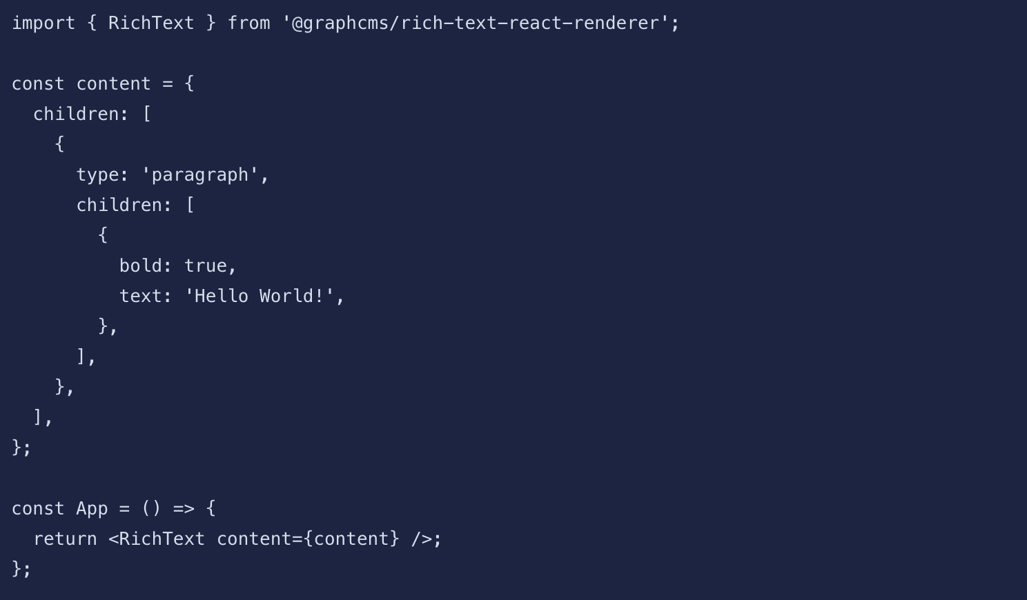
We ended up settling on SlateJS for the rich text editor component, and on React Rich Text Renderer by Hygraph for the renderer in the cards. A look at the docs showed that Hygraph's renderer expected (by default) the exact data structure that the SlateJS editor outputs (by default) - a match made in heaven. 😇
Now, it was time to wrangle the code!
🛠️ Step 3 - HACK!
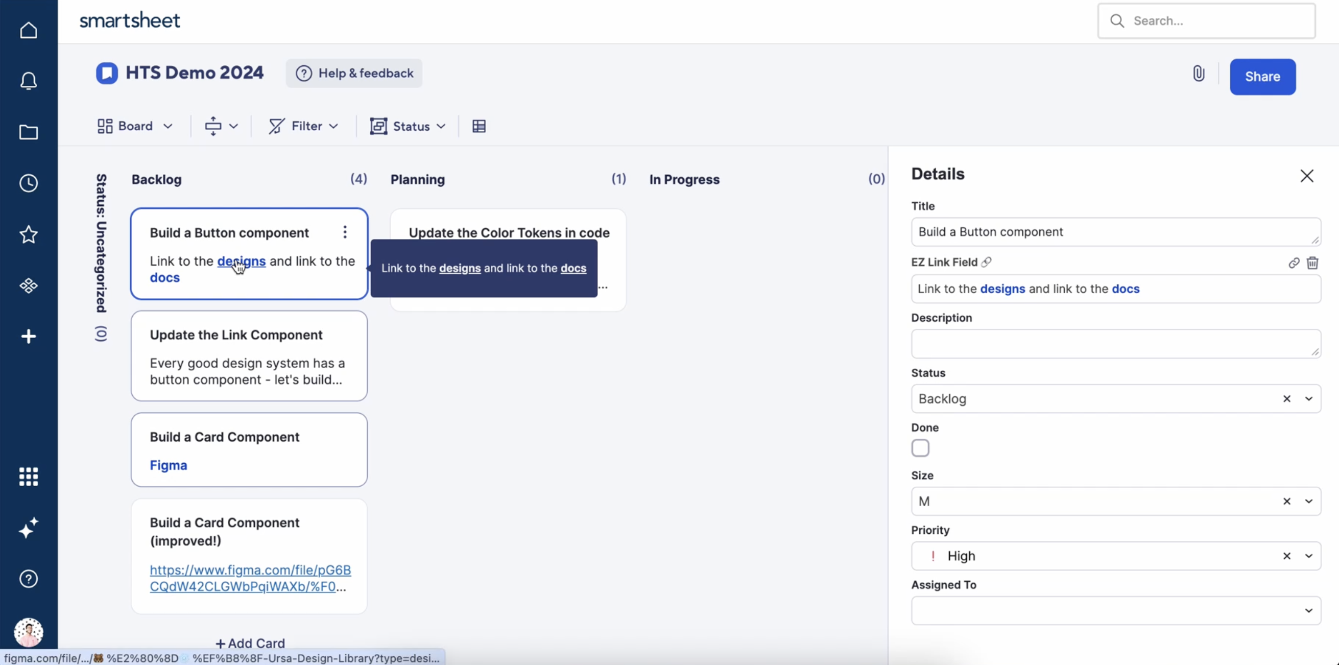
With tech nailed down, we divided and conquered the implementations. We hacked together our solution, adding the renderer to the editor panel (in a very pared-down format where we only added link capability, since editors can also allow many other rich text features), styled with our design system tokens so it matched the rest of the UX (an imperative for a hackweek team comprised of almost all design system engineers!). We added the renderer in cards, and also added the renderer in the tooltip that shows overflow text when the card description gets truncated.
The final 2 pieces of the puzzle:
- Provide a UI/UX for editing/removing links once they're added into the editor
- Integrate the data from the new editor field in the panel into the actual app API, so the rich text nodes can be passed along in JSON to the renderer in the card (two different areas of our codebase).
For item #1 - we added in a nice tooltip flyout editor for links that were already pasted in, inspired by the hero tooltip editor in Slack for the same type of interactions. It came out great! For item #2, we updated the API code to pass JSON data along as intended. The result was a fully working EZ Links solution!
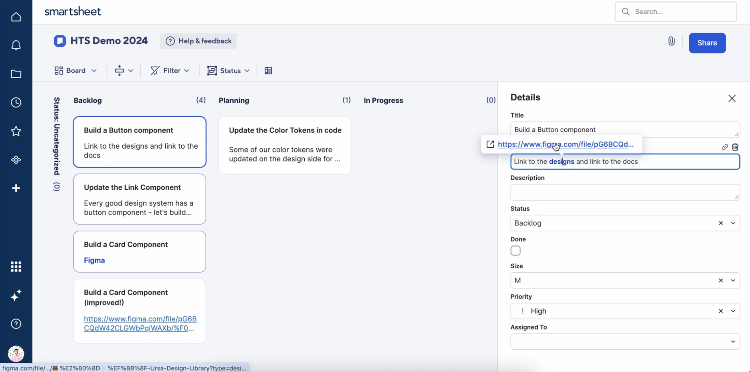
Because the 'pasting' in interaction may not be obvious to all users as an available interaction, we also opted to add a couple simple icon buttons for adding a link and deleting a link (once added). SlateJS has awesome examples on how to do this in their own playground/docs.
Now we were ready to show it off!
🎥 Step 4 - Demo it to the world
Demo day came around and we had a fully working, in-product solution in place! As the hackweek team lead I prepped to give a live demo in a quick 2-3 minute span on demo day. Amongst 70-80 hackweek teams, we presented EZ Links to 1k+ people and our solution was very well received!
🚀 Impact
🧠 Learnings
I learned a ton about implementing rich text editors, renderers, and the various ways they might be able to structure their data (JSON, markdown, etc). I also learned a lot about product areas that I hadn't yet got to work with as a design system team engineer (a very valuable experience for us!). It was SO awesome to learn how to build the exact type of feature I know and love in products I use every day, which was a really rewarding experience.
This was also the second hackweek I've led a team for in my career, so it was fun to cosplay as a team lead once again 😂
🔮 Future Implications
Our solution unfortunately didn't win any of the hackweek awards (it was an EXTREMELY competitive hackweek with AI solutions and tons of other insane projects), but we did garner the attention of some important product and UX folks (even the Chief Product Officer). As of the writing of this article, we've got EZ Links in our backlog and hope to someday find time to implement it into the various views that make the Smartsheet platform the beloved product that it is. And how exciting to play a part in making it even MORE modern and awesome as a platform!
Cheers, Branon