
Rebranding @ Etch AI
A short & sweet rebranding effort for a brand new AI startup
✍🏽 About Etch
Etch is a cutting edge AI-driven platform for faster, better closing binders. Bringing AI to the legal field is an exciting prospect and Etch is on it.
The Project
As a super early-stage startup, Etch was previously benefiting from the design-savvinness of the cofounders, which helped quickly propel them into their concepts, product mocks, and vision - the lifeblood of the business. They approached the point where they felt they wanted an expert to help them elevate the branding to begin to establish their place as a competitor in the AI / legal technology space. That's when they hit me up!
🎨 Branding Redesign
The existing branding leaned into a blue and orange color palette, simplistic typography, and a logo that featured mostly text, with a small notch above the 'E'. Aside from that, there weren't too many deep design decisions.

Starting with the data
I provided the Etch cofounders a branding survey, so I could gather some insights about their current company values, mission, perceived persona, and more. In short, I wanted to better understand their identity as a company. I got some great insights!
- Core values: Security, Trust and Innovation
- Branding expectations: With attorneys and other legal professionals as target users, the branding needs to inspire trust and safety
- Current branding pros and cons: the blue and the meaning it conveys is something they'd like to keep, but the orange is not a requirement. Typography could use a refresh. Overall, a more modern, sophisticated feel may help elevate the brand, etc.
With a new and improved understanding of our brand and design preferences, I got down to business and began the creative process. I experimented with font faces, color palettes, logo concepts, and more.
Eventually, I arrived at some work I was proud of! I threw together a pitchdeck to guide the team through my design decisions. Introducing...
The Etch Logo

The Full Etch Logo features:
- The Etch “E” Symbol
- Indigo/Blue to convey trust, which bleeds through purple into into black to convey security
- Black text color thereafter for authority and as a hearken to legal professionalism
The "E" Symbol Logo features:
- An “etched” design, like a laser engraving/etching for a tech-focused nod to AI-driven acuity and precision
- Subtle gradient for modernity and visual intrigue
- Indigo/Blue to convey trust, which bleeds through purple into into black to convey security
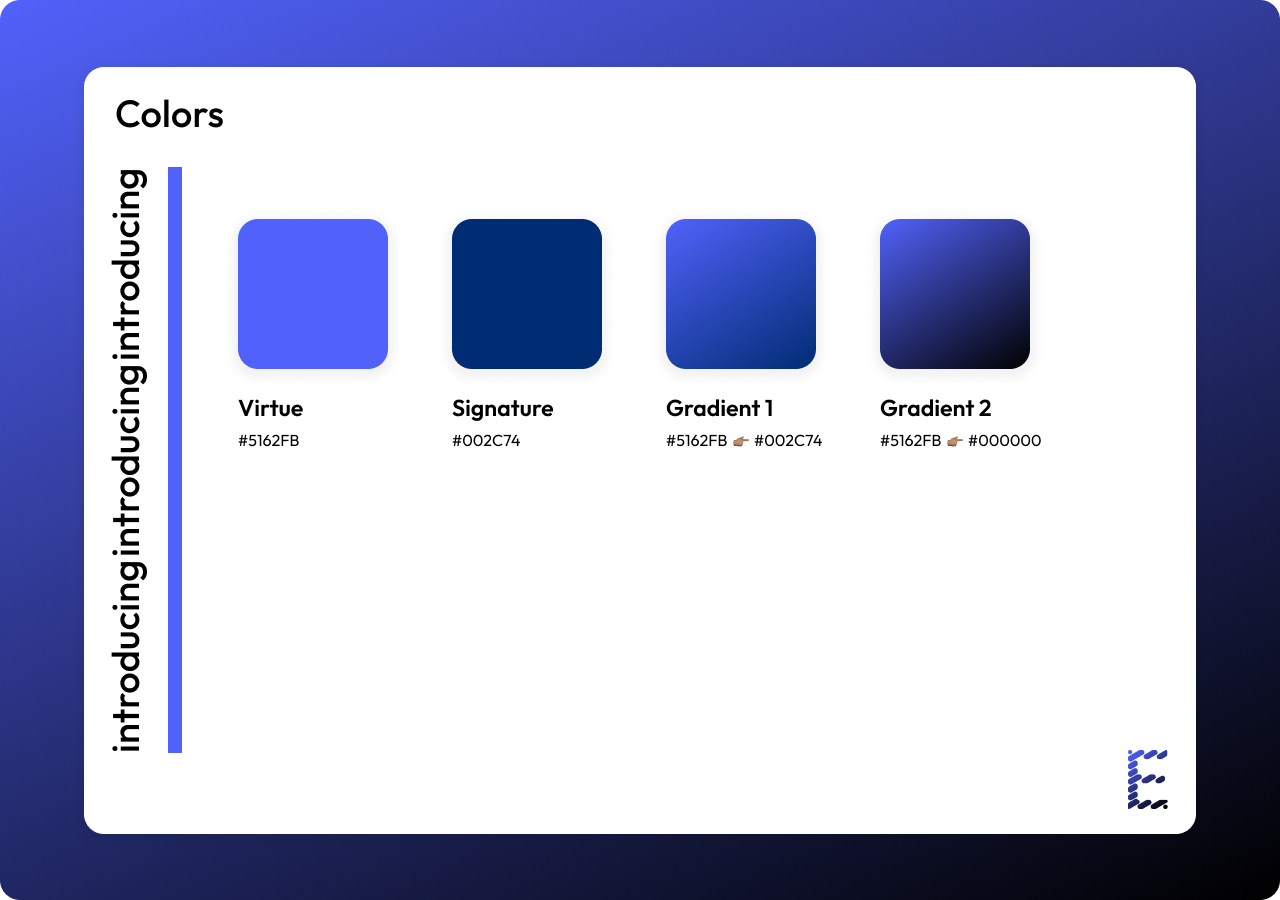
Etch Colors

Etch colors are a visual embodiment of its values in the context of its market space. Purples and blues are used on two ends of the color spectrum:
- Bright: when used vibrantly, they convey the energetic youth characteristic of a fresh AI tech startup
- Dark: when used deeper, they convey quality, trust, wisdom, and authority.
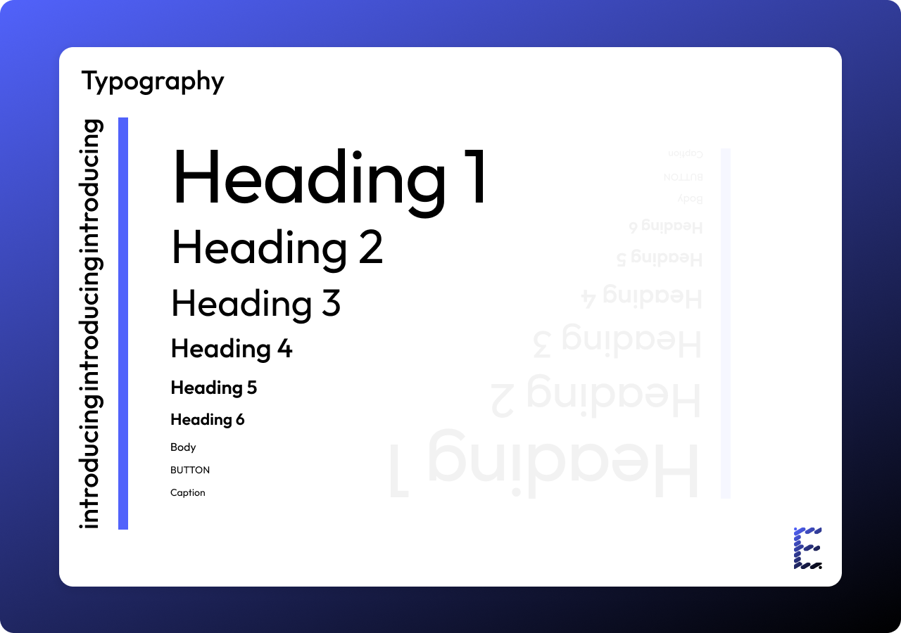
Etch Typography

I settled on the "Outfit" typeface for a few reasons:
- Modern, legible, clean, and authoritative
- Great match for Etch values: trust, innovation, and technology-forward
- readability across the entire scale!
I had a blast!

The Etch team loved the new branding and design decisions, and felt the choices made reflect their company identity well. I had a blast working on this project and can't wait to see the new Etch branding live in their products, website, and more!