
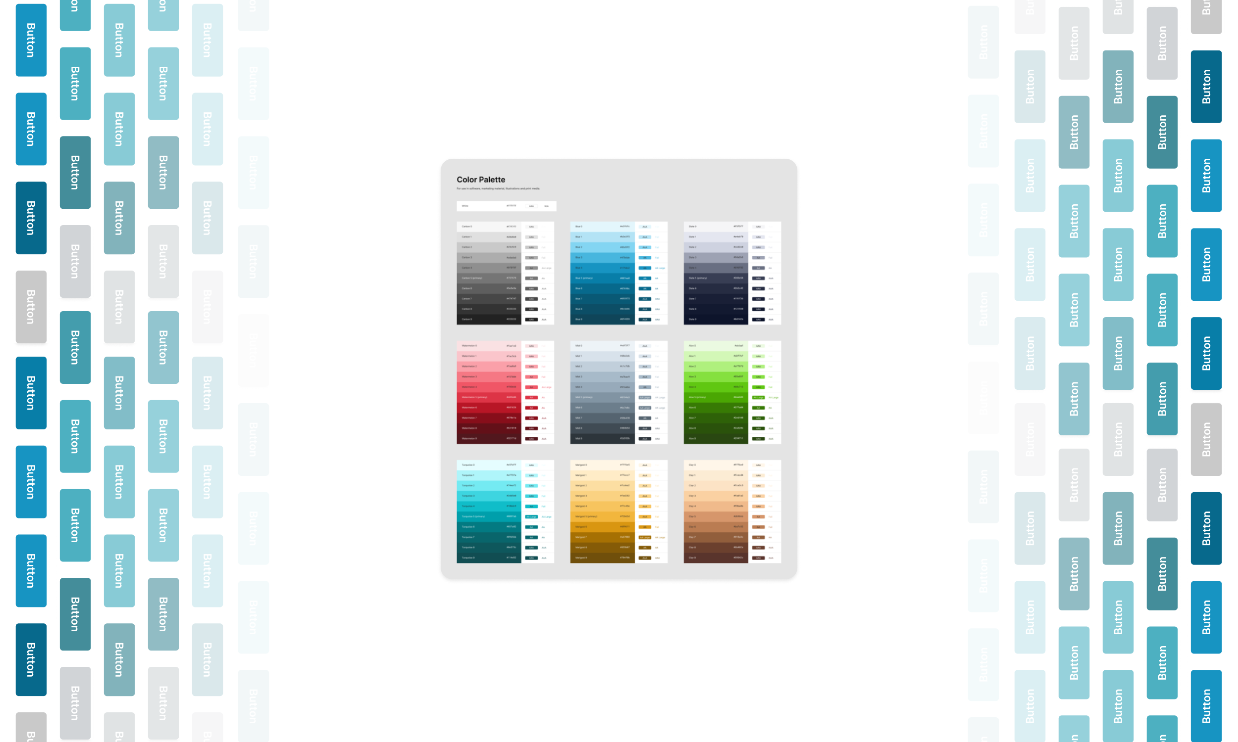
Dynamic Token Layers @ Endpoint
Implementing dynamic tokens with Figma's new 'variables' feature
✍🏽 About Endpoint
Endpoint is a real estate tech company backed by First American.
Endpoint offers products for seamlessly handling real estate transactions from start to finish, as well as a product for notaries and a new workflow-building platform for real estate back-office operators.

⚠️ The Problem
A multi-layered token system is crucial to building robust, flexible theming, both in code and in Figma! For our BlockParty Design System at Endpoint, we needed to add more layers of tokens to our system on top of our primitives in order to move toward flexible theming.
As a team, we needed to explore the benefits of doing tokens this way as a first step.
✨ The Solution
To demonstrate the concept, I leveraged Figma's brand new 'variables' feature to create a 3-layer token system POC to share with the team.
🧠 Learning About Tokens
Credit where credit is due: I learned about the benefits of token layers myself from Valentino Baptisa at the Into Design Systems virtual conference a few months before this project. After learning about the power of layered tokens, and upon staring down the barrel of our team's needs for more complex theming capabilities in the design system, I knew quickly that this approach would work wonders for us. So what is the basic idea here, then?
⚙️ How It Works (but really concisely I promise!)
The idea is simple - build out several layers of tokens that stack on top of each other, referencing values from the layer below. Three common ways to do this:
- Primitives: basic, raw, global design choices (like purple500, which stores a raw hex value)
- Semantic: UI-specific, descriptive design units (like cta.primary, which stores a reference to a primitive token)
- Component: component-specific, granular design units (like button.background, which stores a reference to a semantic token)
Here's this info in a (super simplified) graphic, for you visual folks like me 👇🏽
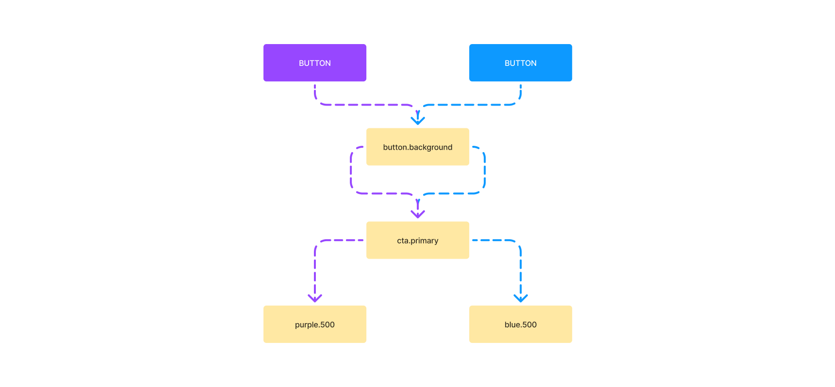
So how does this create flexibility? Well, if components are built using component tokens, which point to semantic tokens, which point to primitives, any consumer of the system's components can swap out the primitive layer and point the semantic layer to these new custom values, and the components will automatically adapt to those new primitives!
Note the colored pathways in the graphic above 👆🏽 If the Button component assigns its button.background component token to the semantic cta.primary token, that token can be pointed to different primitives (in this case, purple500 OR blue500), and that makes the button background dynamic!
Okay - enough theory, let me show you how I did it in good 'ol Figgy.
⚒️ Configuring Token Layers in Figma
🪙 Primitive Tokens
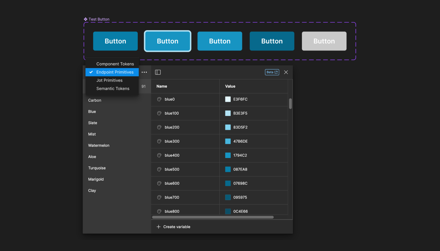
Figma had JUST come out with variables (I believe in miracles 🎶) so I knew it'd be the perfect time to try this out. Figma's variables feature allows you to store key/value pairs, where the key is the name and the value is... well, the value. You can even assign a variable as a value for another variable. And these variables can be organized into different collections. Perfect.
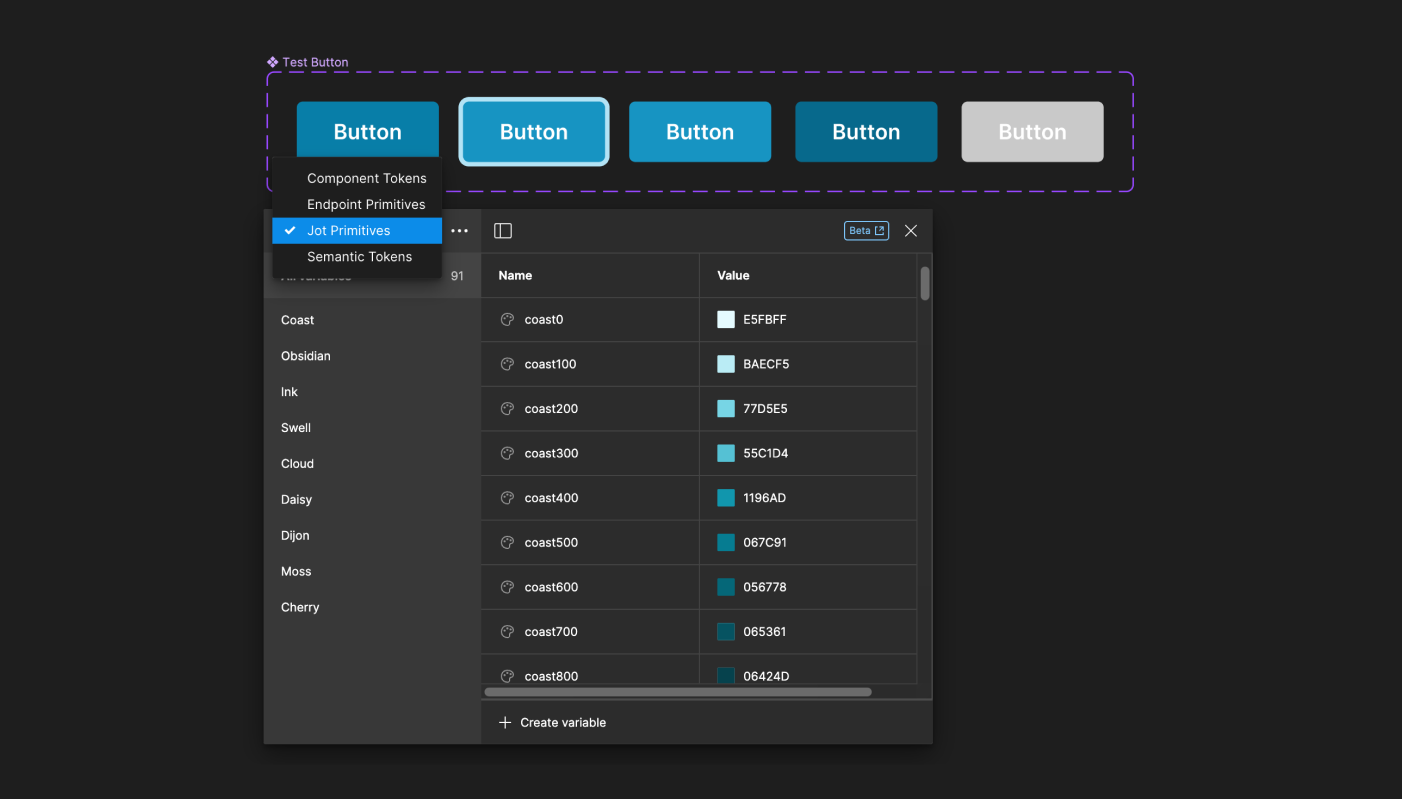
I cranked open a new file for my POC and began to translate our primitive token sets into collections of variables in Figma. We had different sets of primitives based on different themes (Endpoint, Jot, etc.) that are used in different products. The result here was 2 primitive variable sets.
🏷️ Semantic Tokens
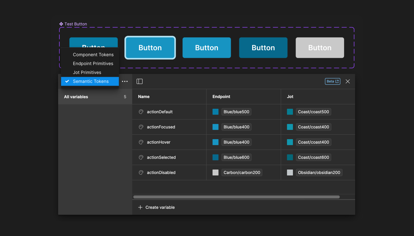
Now it was time for the semantic layer. Since this was a POC, and I wanted to demo the concept, I made up some semantic layers (but inspired by real semantic tokens I've used in previous design systems!). I added in some general system-level, UI-related tokens and pointed them to primitives from either of the theme collections (this part is super important - just wait!):
- actionDefault
- actionFocused
- actionHover
- actionSelected
- actionDisabled
🧩 Component Tokens
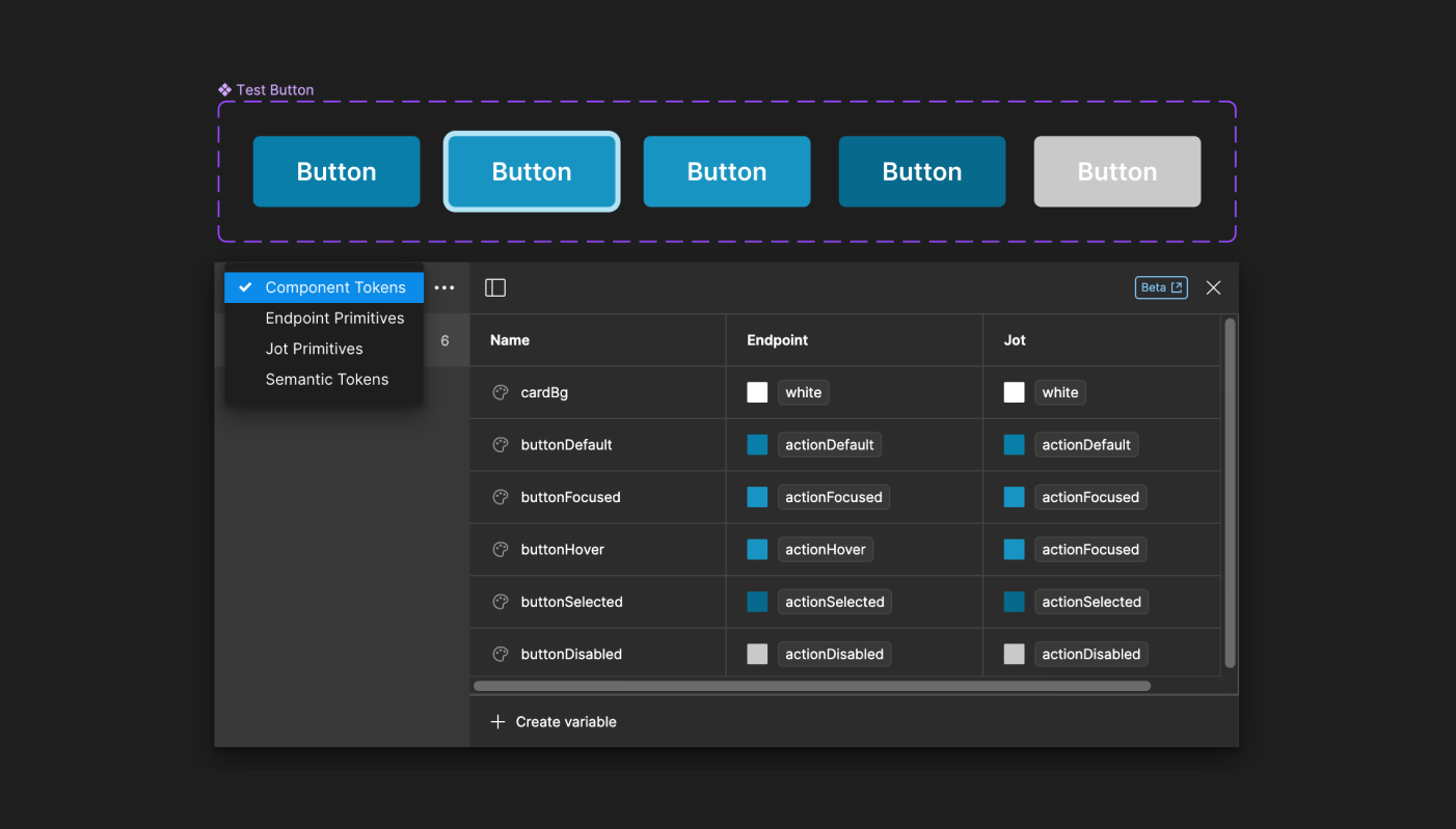
Now it was time for the last layer - the component layer. Here I simulated some button-specific tokens, and pointed them to tokens from the semantic layer, like so:
- buttonDefault -> actionDefault
- buttonFocused -> actionFocused
- buttonHover -> actionHover
- buttonSelected -> actionSelected
- buttonDisabled -> actionDisabled
🎛️ Switching Themes & Tying it Together
Now for the fun part! Next, we went to our nifty button component and set the background color to the component tokens we created for each state! Just like we would with a normal hex color.
For variables, Figma allows you to set frames and/or pages to a specific collection! Since we configured our variables with 2 primitive sets, one for our Endpoint theme and one for our Jot theme, we should see the button components change colors!
To drive the example home, I created two frames in a file and set one to Endpoint and one to Jot. With our buttons' component tokens pointed at semantics that contain primitive values by the different themes, Figma knows to render either primitive collection and the button changes colors automatically!
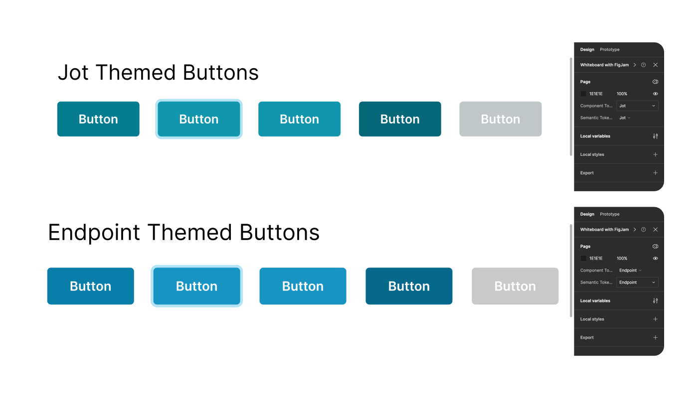
Okay, okay, so the colors I chose are barely different - my mistake. But look close enough I promise they're different shades of blue ('blue' primitives vs 'coast' primitives) 🥲
But that's it - we've now got a 3-layer token system in Figma using collections of variables, with frames configured to either of the themes and a single button component that render those theme colors automatically. NICE. ✨
Now it'd be super easy to demo to the design org the power of this configuration, and to show off a world in which Jot product design files and Endpoint design files can pull in the same components from our design system Figma lib, getting the automatic theming and branding they require for their product. Out of the box.
🚀 Impact
🧠 Learnings
Learned a ton throughout the conference and this POC about the insane power of token layers and how they can enable a dynamic, flexible theming architecture in Figma and code! And speaking of code...
🔮 Future Implications
Many next steps could be born out of this work. Including, but not limited to:
- Creating the full range of semantic and component layer tokens (no small undertaking)
- Implementing the token layers in code
- Implementing a customizable ThemeProvider in our React design system package code. Lots to say about that, but we'd want to essentially do a baseTheme approach that can be passed into a context provider, with the possibility of overrides in the primitive level (to start). Just like in Figma, these overrides will automatically percolate up to the components if the token layers are configured correctly in code.
From here, lots to do, but the sky's the limit :)
Cheers, Branon